Looker Studio is a widely-used and free data visualization tool that transforms your data into customizable dashboards. With Two Minute Reports, you can connect over 30 data sources, uncover essential insights, and create impactful reports in Looker Studio within minutes.
Before you get started, ensure that you’ve integrated relevant data sources. If not, connect your data source with Looker Studio via TMR with the four simple steps outlined below:
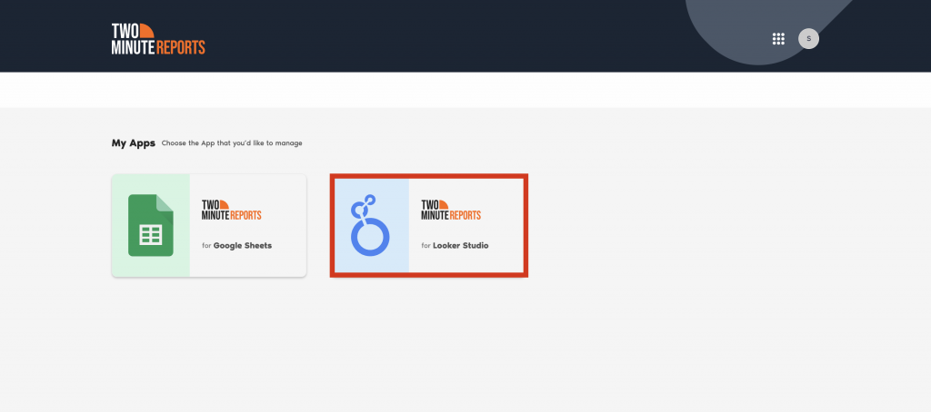
Step 1: Visit https://apps.gox.ai/.
Step 2: Under My Apps, select Two Minute Reports for Looker Studio. Next, choose your team. TMR automatically redirects you to the connectors page if you have only one team.

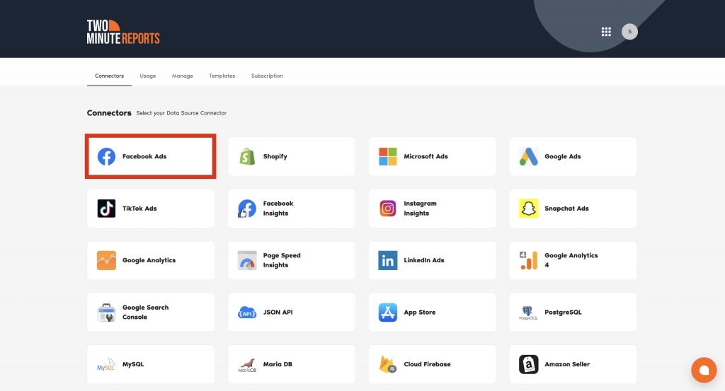
Step 3: On the connectors page, select your preferred data source to integrate with Looker Studio.
For example, let us consider Facebook Ads. Click “Facebook Ads,” and under the data sources tab, click + Add New. Refer to the screenshots below for easy understanding.

Step 4: Next, specify the name for your connection and click “Login with Facebook” to authorize your Facebook Ads account. Once you successfully authenticate, Two Minute Reports will connect to your Facebook ad account.
Likewise, you can repeat the above steps for integrating with other data sources. Doing so makes connecting data sources directly from the connector page easier than manually navigating to Looker Studio each time.
And that’s it. You’re ready for the next step.
How to run a query in Looker Studio (a step-by-step tutorial)
Step 1: Navigate to the Query Configs tab and click + Add New.
| Query config lets you gather data from multiple accounts in a single query, making it easier to view centralized insights in your Looker Studio dashboard. A query essentially gathers and organizes your data for reporting and analysis. |
Step 2: The “Adding New Query Configuration” window appears. Here, you can choose the Facebook data source you’ve already created from the list of options and click Next.
Step 3: You’ll land on the “Add Query Config” tab. Name your query, select one (or more) account, and configure your Facebook report by specifying the attribution window and other relevant options, as shown below.
Once done, click Save.
Step 4: You’ve successfully created a new query configuration. This approach brings your data source connector and key ad accounts under one dashboard to simplify data analysis and improve decision-making.
Step 5: After adding the data source and query config, click Create Report at the top-right corner as shown below:
Step 6: Select the query config you created in Step 3 (SAMPLE TEST). Click Next and choose Create Report from scratch to open the Looker Studio dashboard.
Refer to the screenshots below.
Note: To create Looker Studio reports more efficiently with templates, check out our article – “How to use templates for Looker Studio.”
Step 6: Once the Looker Studio dashboard opens, select the relevant team and the appropriate Query Config. Click the Connect button at the top-right corner.
Here, you can view the list of available Facebook Ads metrics. Next, click the Create Report button as shown:
Step 7: After completing the above steps, you’ll be directed to the Looker Studio dashboard.
Here, you can drag and drop metrics and dimensions from the sidebar on the right and include different charts and visualizations for your Looker Studio reports to deliver a compelling narrative.
To add a chart, navigate to your Looker Studio dashboard and click “Add a chart”. You can choose from the list of options as shown below.
Step 8: For example, you can use table format for detailed data representation. Scorecards highlight critical metrics, and time series illustrate trends and pattern changes. Likewise, you can also add date range control to analyze performance during a specific period.
Here’s a breakdown of what works well in each format:
| Visualization type | Best suited for | Example |
| Graphs | Monitoring trends, changes over time, and comparisons. | A line graph showing the monthly website traffic over a year, highlighting the ups and downs in customer visits. |
| Tables | Representing granular information for precise reporting and analysis. | A table displaying impressions, clicks, and conversions categorized by month to track detailed campaign performance. |
| Charts | Present your data in various forms such as pie charts, scatter plots, gauge charts, etc., to communicate key insights visually. | A pie chart showing the percentage of total conversions attributed to each social media platform. |
Note: When using excessive charts or other visualization types, Looker Studio might slow down in execution. Check out our five tips to increase the speed of your Looker Studio reports to optimize the performance of your Looker Studio dashboard.
Step 9: You can repeat the same steps to add the required tables/charts to your Looker Studio report by selecting the metrics and dimensions that reflect your crucial business goals.
This way, you can get a clear picture of what works, what doesn’t, and the next steps with zero hassle.
Customize your Looker Studio reports
Once you’ve created your reports, organizing them can highlight the most relevant information, driving better insights and decision-making. By default, Looker Studio has sorting options to arrange your data in ascending and descending order. You can also apply custom filters to showcase only necessary information.
Once you’ve applied relevant filters, you can view the customized output and share valuable reports that communicate key insights to your clients.
We’ve also listed some of the prevalent issues marketers face while running reports on Looker Studio, along with actionable solutions to resolve them. Read the full article here.
We hope you found this guide useful. If you have any questions, please get in touch with our support team via chat or support@twominutereports.com.