There are two most important features of google sheets that most people need, but never know how to use it properly. Knowing to use these two features alone, will make you an above average Google Sheets user and allow you to create some pretty advanced charts and customization with your data.
You can save this article for reference, so that you can refer back to it whenever you need to do some advanced data customizations.
In this article we’l go through one of them, PIVOT TABLE. The other one is VLOOKUP().
Let’s get started.
Pivot Tables helps in
- Easy summarisation of data
- Easy data analysis
- Prepare data for better charts
- Support Drill Down analysis
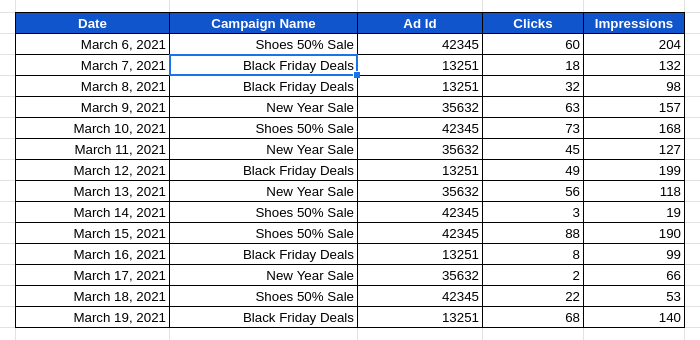
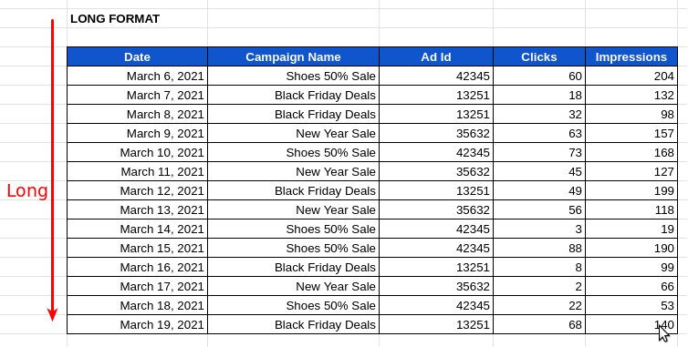
Let’s say you have a table with a list of Campaigns and their daily performance like below,
Now if we wanted to find out how the Ad performance varied for each Ad Campaign, a pivot table would come handy.
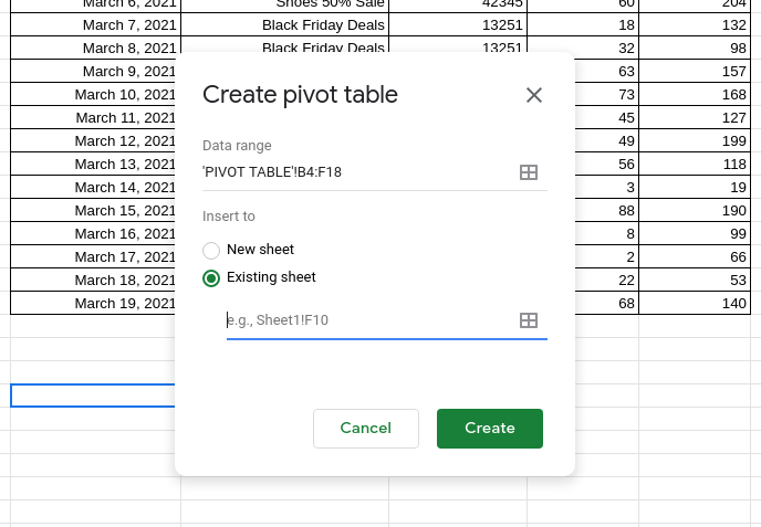
Now select the entire table with mouse and go to Data -> Pivot Table
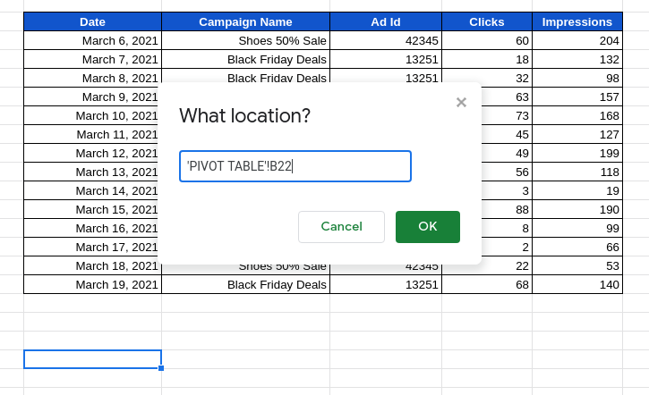
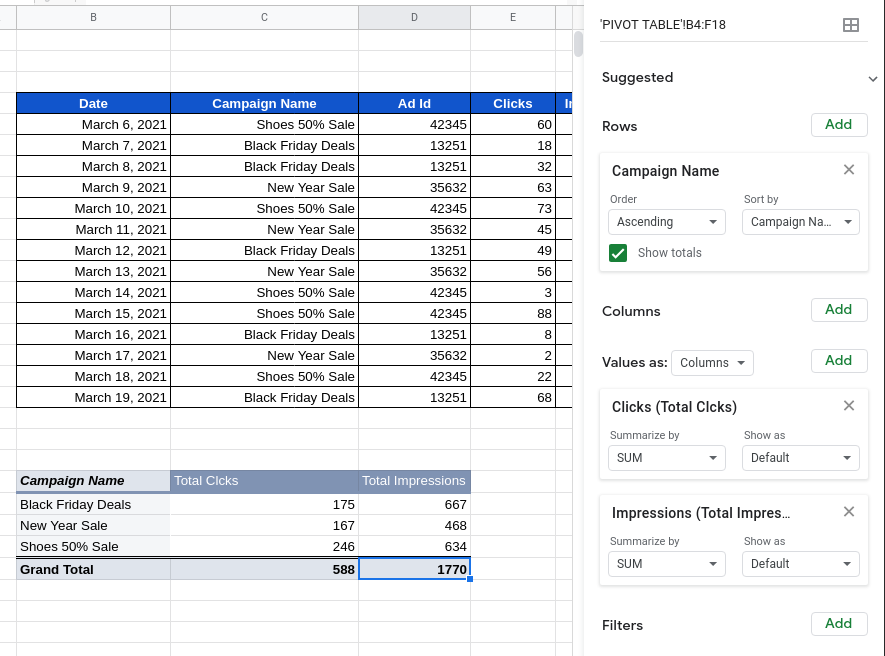
Select “Existing Sheet” option, click on the input field and click on any cell below the table. This will pick up the pivot table location automatically like below.
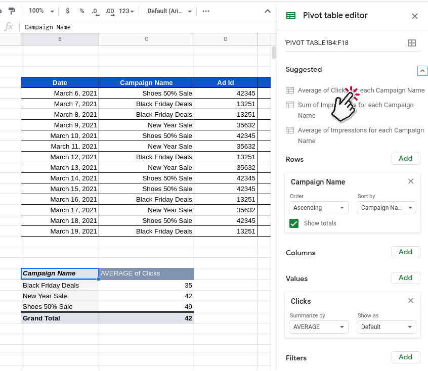
Now create a Pivot table editor that will pop up on the sidebar. Lets go through each of the benefits and how to customise the pivot table.
Easy summarisation of data
You can browse and select one from Suggested list, to automatically define your new Pivot Table
The pivot table will summarise data in an easy to read format. You can select from the different suggested items to summarise the data differently.
Easy data analysis
I would like to find the total Clicks and Impressions for each Campaign. So I would add Campaign Name in Rows section and Add Clicks & Impressions in the Values section, selecting SUM in the Summarise by field.
We can change the name of new columns from “SUM of” to “Total”
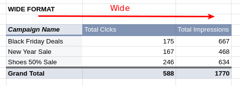
From this we can easily see that the “Shoes 50% Sale” campaign has performed better with the most clicks.
Prepare data for better charts
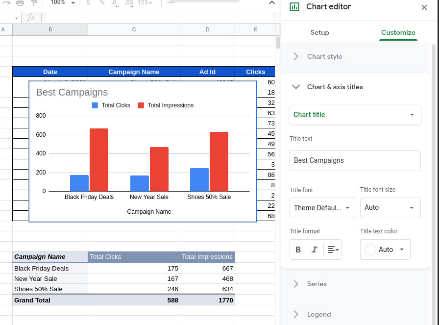
Now with our new pivot table we can easily create charts comparing all the campaigns in a single graph like Best Campaigns, which was not possible before.
Select the pivot table and go to Insert -> Chart. The new chart will allow easy side-by-side comparison of the performance ( clicks, impressions ) of the different campaigns in our pivot table.
Support Drill Down analysis
We can investigate the results further by double clicking on any of the cells in the Pivot Table. Lets double click the cell with value 246.
A new sheet will be created with details specific to that cell. This helps in drilling down data and analyzing our results further.
These powerful features really make Pivot Table one of the top go-to tools for a Data expert.
You can now go on with creating your own Pivot Table.
Long and Wide data format
What Pivot table does is, in technical terms, Pivot Table converts data from the long format to wide format
It helps turn data from this
To this
We don’t need to know the definitions of long and wide formats. Just looking at the above images will give a good feel for what they are.
The wide data format is what most charts and reports need. So any time you struggle with creating a report or a chart, maybe you need to use Pivot Tables to get data in wide format.
You can find the spreadsheet used here.
