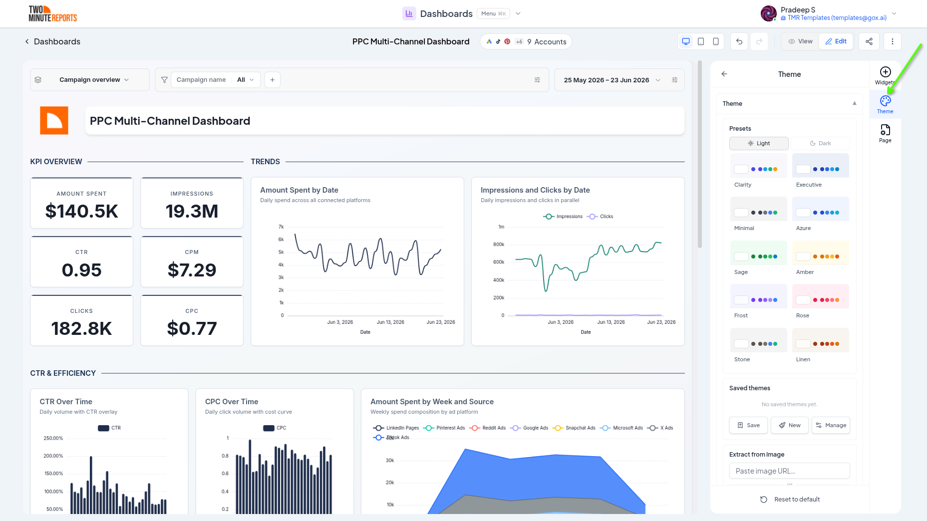
Theming
Theming controls how a dashboard looks. A theme sets the background, fonts, colors, and widget styling for the whole dashboard at once, so everything looks consistent and on-brand. You can also override styling on individual widgets and save themes to reuse across dashboards.
What You Can Do
- Style the entire dashboard from one theme editor
- Set backgrounds, typography, and a semantic color palette
- Define default widget styling and chart appearance
- Override the theme on individual widgets
- Save themes and apply them to other dashboards
The Theme Editor
Open the theme editor in edit mode to style the dashboard. Changes preview live on the canvas as you adjust them.
Background
Set the dashboard background to a solid color, a gradient, or an image, useful for matching a client's brand or creating a polished presentation surface.
Typography
Choose the font family, base size, and weight used across the dashboard so headings and labels share a consistent type style.
Colors
Define the palette the dashboard draws from, including semantic colors that carry meaning across widgets:
- Positive - good outcomes (typically green)
- Negative - bad outcomes (typically red)
- Warning - values that need attention (typically amber)
- Neutral - baseline and secondary values
These colors flow into charts, compare deltas, and gauge zones so good and bad always read the same way.
Widget Styling
Set the default look for widget containers: border, shadow, corner radius, padding, and background. This gives every widget a consistent "card" style without configuring them one by one.
Chart Defaults
Set defaults that every chart inherits, such as legend position, grid lines, bar corner radius, area gradient, and donut hole size. Individual widgets can still override any of these (see Widgets & charts).
Animation
Control how charts animate when they load, including duration and easing, or tone animation down for a calmer, more corporate feel.
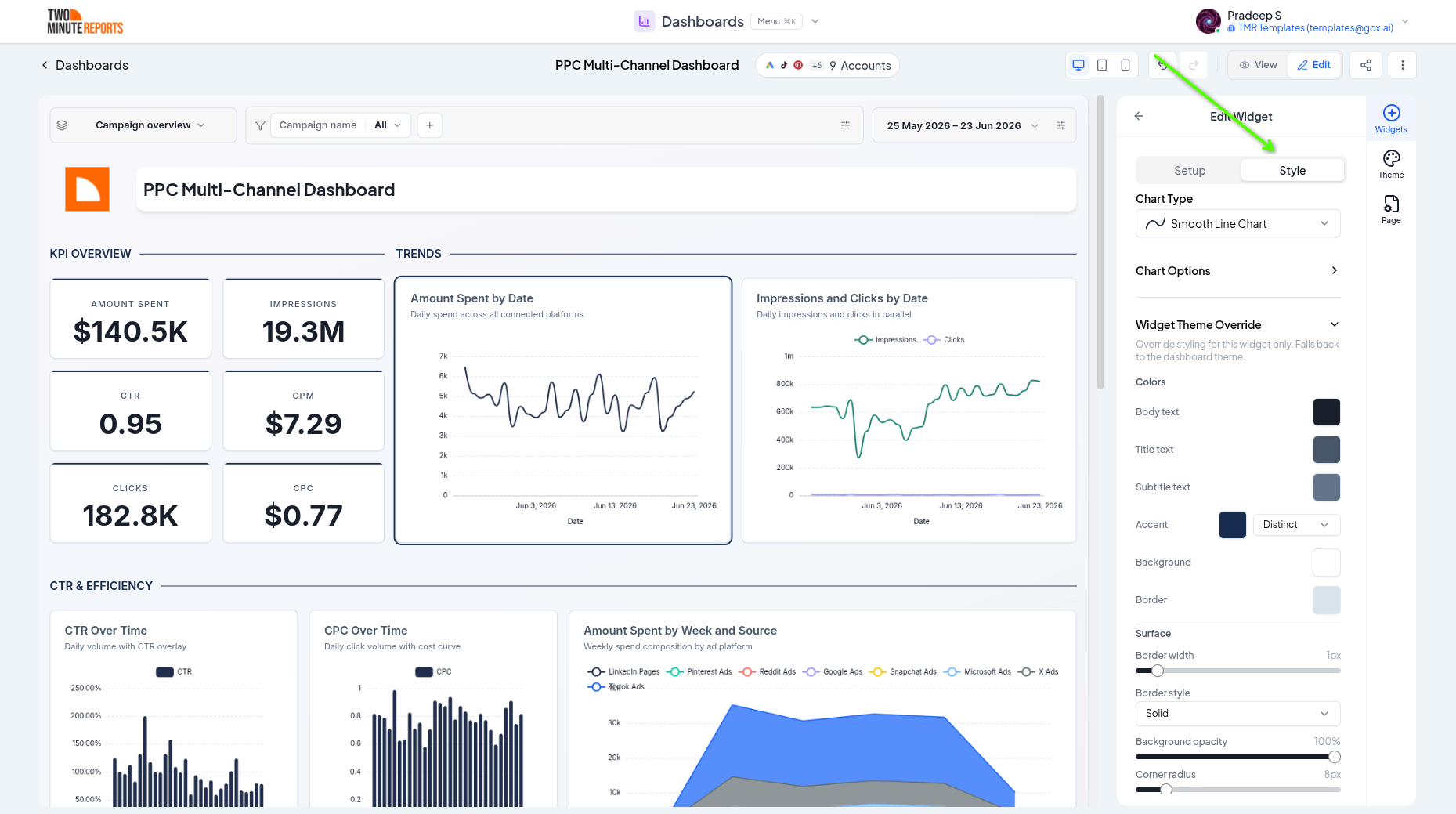
Per-Widget Overrides
Sometimes one widget needs to stand out, for example a hero scorecard in your brand's accent color. Open a widget's theme override to change its colors, fonts, and container styling independently of the dashboard theme. Everything else continues to follow the theme.
Saved Themes
Once you've designed a look you like, save it as a reusable theme. Saved themes belong to your team, so you can:
- Apply the same theme to a new dashboard in one step
- Keep every client dashboard on a consistent house style
- Update a saved theme and reapply it when your branding changes
Best Practices
- Build one branded theme per client and reuse it across their dashboards
- Keep semantic colors meaningful, don't use your "positive" green for a neutral metric
- Favor subtle widget styling (light borders, soft shadows) so the data stays the focus
- Preview in view mode and on a smaller screen to confirm contrast and readability
Next Steps
- Widgets & charts - Override chart appearance per widget
- Sharing & exporting - Add branding to shared links
- Layout & pages - Arrange the canvas your theme styles
Data, Dates & Filters
Connect accounts, set date ranges with period comparisons, and apply filters across a whole dashboard or per page in Two Minute Reports.
Sharing & Exporting
Share a dashboard with a public link with granular viewer permissions, custom branding, password protection, and expiry, or export it to PDF or PNG.