Widgets & Charts
Widgets are the building blocks of a dashboard. Each widget is a single block on the grid that displays your data as a chart, table, scorecard, map, or piece of text. This page covers the full catalog and how to configure a data widget.
What You Can Do
- Add any of 20+ widget types to your dashboard
- Visualize one or many metrics, broken down by any dimension
- Filter, sort, and add moving averages to a widget's data
- Show period-over-period change directly on a widget
- Fine-tune the appearance of each widget without touching its data
Adding a Widget
In edit mode, open the widget picker. Widgets are grouped by category (scorecards, charts, tables, maps, and content). Click a widget to drop it onto the canvas, or drag it onto the grid to place it exactly where you want. Once added, select the widget to open its editor and connect it to data.
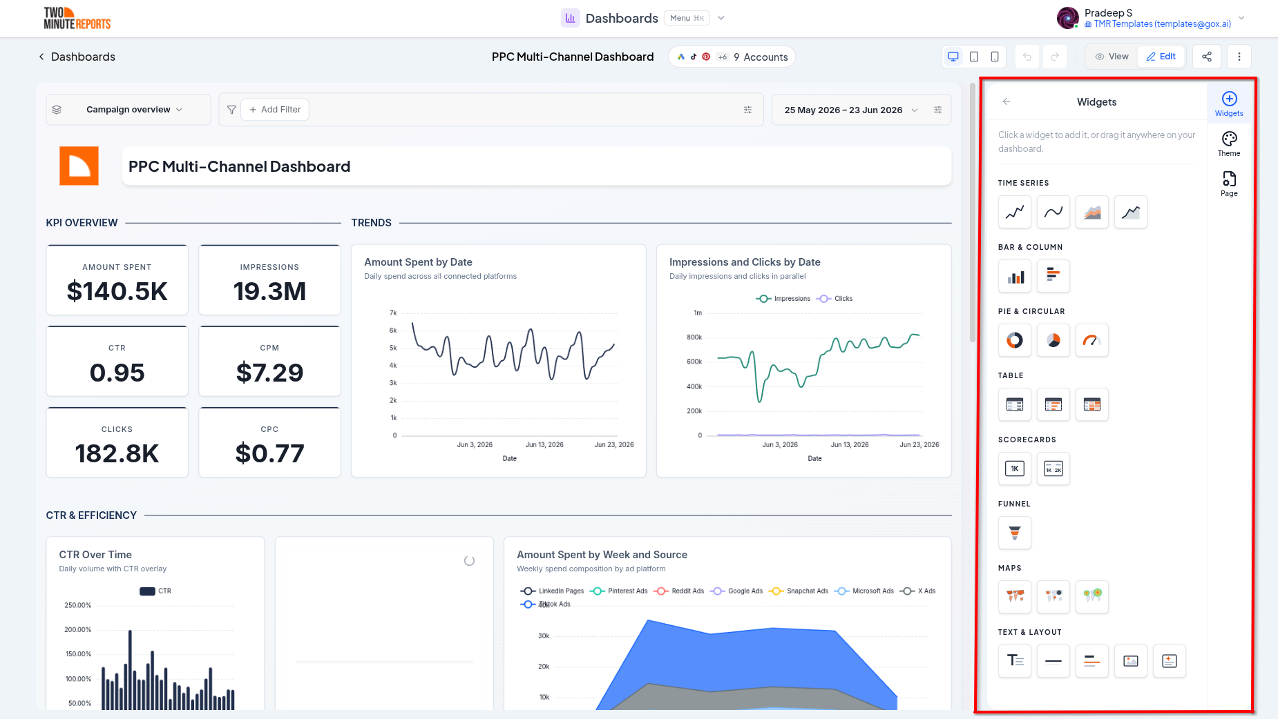
Widget Catalog
Scorecards
Single-number summaries, ideal for headline KPIs.
- Scorecard - one big metric, optionally with a period-over-period delta
- Multi-scorecard - several metrics side by side in one widget
Charts
- Line - trends over time for one or more metrics
- Sparkline - a compact trend line with minimal chrome
- Area / Stacked area - trends with filled areas; stacked area breaks a metric down by a second dimension
- Bar / Column - compare values across categories, horizontally or vertically
- Pie / Donut - part-to-whole share of a single metric
- Gauge - a single value against a dial, with optional colored threshold zones
- Funnel - stage-to-stage drop-off, with standard and enhanced (log-scaled) variants
Tables
- Table - rows and columns of metrics and dimensions
- Table with bars - in-cell bars to compare values at a glance
- Table with heatmap - cells shaded by value to highlight highs and lows
Maps
Each map plots one metric against one geographic dimension (country, country code, or latitude/longitude).
- Geo map - a filled choropleth shading countries by value
- Bubble map - sized, color-scaled bubbles at countries or points
- Geo heatmap - a density blanket highlighting hot spots
Content
- Text - headings and rich text for titles, notes, and context
- Section divider - an accent heading to separate areas of a page
- Divider - a simple visual rule
- Image - embed a logo or image by URL or upload
- Custom - embed your own HTML for anything the built-in widgets don't cover
Configuring a Chart
Select a data widget to open its editor. The available options depend on the widget type, but most charts share the same building blocks.
Data Source
Choose which connected accounts the widget pulls from. By default a widget uses the dashboard's default accounts, but you can override the accounts for an individual widget.
Metrics and Dimensions
- Metrics are the numbers you measure (spend, clicks, revenue, conversions, and so on)
- Dimensions are how you break those numbers down (by date, campaign, country, device, and so on)
Different widgets accept different counts, for example a scorecard takes one or more metrics and no dimension, while a line chart takes a time dimension plus one or more metrics. For stacked area and other stacked charts, you choose a primary dimension (group by) and a separate breakdown dimension (stack by).
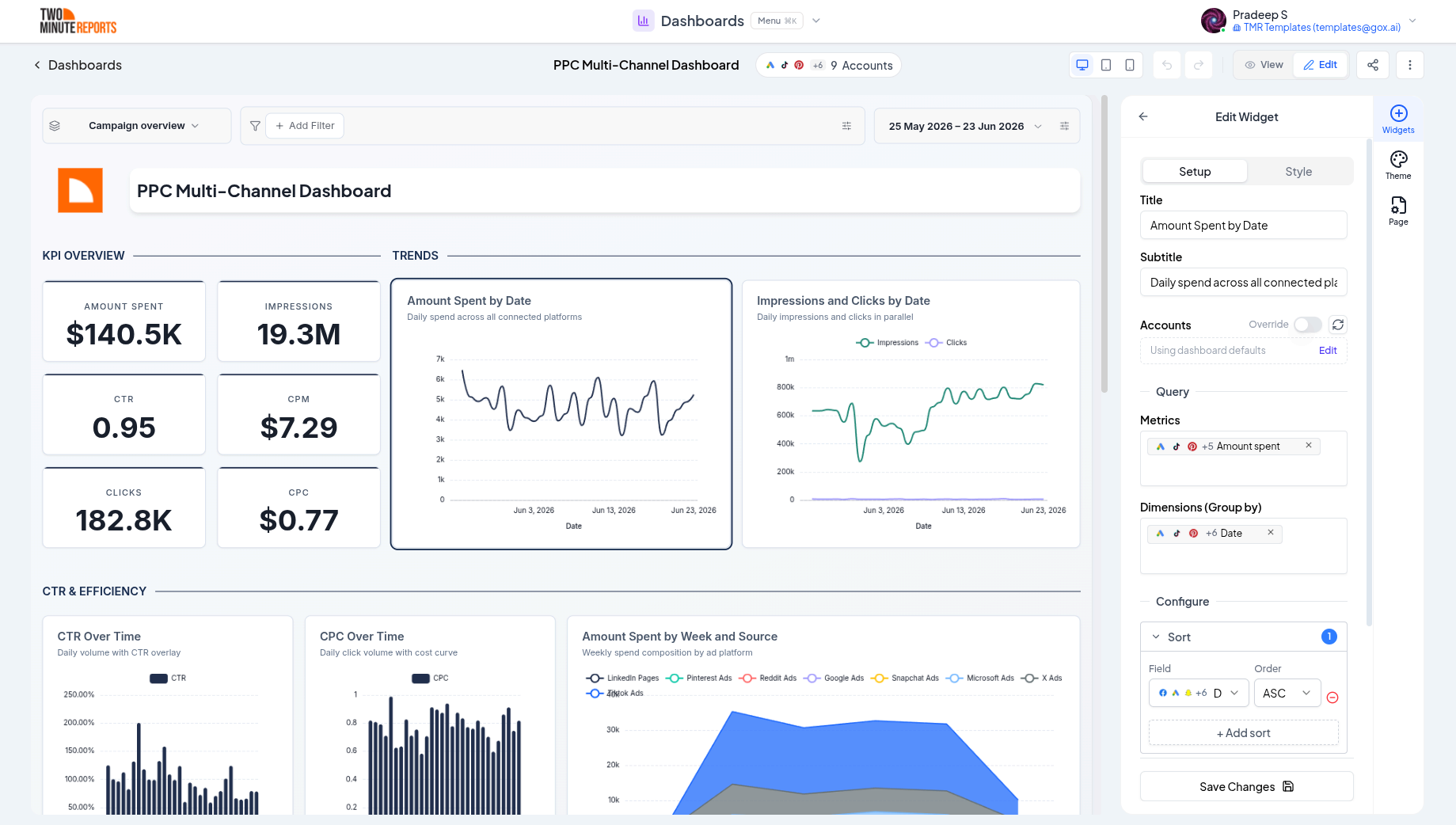
Filters
Narrow a widget's data to exactly what you want. Filters support a range of operators:
| Operator | Matches rows where the field… |
|---|---|
| Contains / Does not contain | includes (or excludes) the text |
| Equals / Does not equal | exactly matches (or doesn't) |
| Greater than / Less than | is above or below a number |
| In | matches any value in a list |
| Regex matches / Regex does not match | matches a regular expression |
Sorting
Sort the widget's results by any field in ascending or descending order, for example highest spend first.
Running Averages
Add a moving average over a chosen number of days to smooth out noisy day-to-day trends.
Compare
When a compare period is active, supported widgets can display the change versus that period as a delta. Each widget independently chooses whether to show the comparison and whether to display it as a percentage or an absolute difference.
Display Options
Beyond data, each widget exposes appearance options that don't change the underlying query. Depending on the widget type, these can include:
- Legend - show or hide it and choose its position
- Data labels - show values directly on the chart
- Axis - axis titles and a fixed min/max for the value axis
- Grid lines - show or hide them
- Bar radius - round bar and column corners
- Gradient fill - toggle the gradient under area charts
- Row limit - cap how many rows or categories are shown
- Donut - hole size and an optional center label
- Gauge zones - colored thresholds for good/warning/bad ranges
- Scorecard format - prefix/suffix, decimal places, abbreviation (1.2K, 3.4M), and an accent border
- Table alignment - align dimension and metric columns, and abbreviate large numbers
Best Practices
- Lead each page with scorecards for the headline numbers, then detail below
- Keep a single widget focused on one question; split complex views into multiple widgets
- Use tables for precise values and charts for trends and comparisons
- Limit rows on bar and table widgets so the most important categories stand out
Next Steps
- Layout & pages - Arrange your widgets
- Data, dates & filters - Control the data feeding every widget
- Theming - Style your widgets and charts
Creating a Dashboard
Three ways to start a dashboard in Two Minute Reports: from a blank canvas, from a ready-made template, or by describing it to AI.
Layout & Pages
Organize a dashboard across multiple pages and arrange widgets on a responsive drag-and-drop grid, with resizing, auto-align, undo/redo, and view and edit modes.